I've been watching a lot of F1 recently, yes. Drive to Survive did make me start watching, don't judge me. I also love AI/ML work so why not put the two things together?
So, what we're going to do is build a (hopefully) accurate model that can predict who is going to end up on the podium on race weekend!
The general flow of this project is going to be:
- Do some exploratory data analysis
- Create a heuristic base model for comparison
- Train a model to try and beat that heuristic model
- Iterate, engineering new features until we exhaust our hypotheses
- Productionize our model, using all of the MLOps tooling (MLFlow, evidently, lakefs, etc.)
- Measure how our model performs over time and watch for drift, or further enhancements we can make
Tell me what you want, what you really really want.
Before we can do any fun ML work, there are three fundamental questions we need to answer:
- What do we actually want to predict?
- What is our metric of success?
- What is the life-cycle we'll use for our modeling?
What do we want to predict?
We want to predict who will finish on the podium. The reason we don't go for who will win is because there are a lot more positive labels, which means we have a much easier time with reliability in training, as it gives the model enough positive examples to actually learn what a podium finish looks like rather than just saying "Nobody gets P1" and still technically being 95% accurate.
Also, a P1 finish can come down to lots of different factors such as "Did Max stay up late again playing SimRacing or Minecraft?" that are not necessarily captured in a simple dataset like this one. So just going for podium finishes is more achievable.
What is our metric of success?
It's cheating to define our metric afterwards (P-Hackers I'm looking at you), so it's important that we do this before we touch anything. I think we should go with a Brier Score/ROC-AUC. I'm choosing ROC-AUC because we can slide around that classification threshold on the probability to assess the whole model not just a single slice like F1, F1 also suffers more here due to the imbalance in the dataset making it easier to game (You only get 3 "winners" out of 22, so saying nobody gets the podium would actually be a technically good model...).
Brier score is a great counterpart to ROC-AUC because where ROC-AUC cares about position, Brier score is the mean of the square of the difference of the probabilities between the expected and actual. So, if we get a good result but our model was very under/over confident, it gets rightly penalized for this.
One thing to bear in mind here is that people in the top 3 still sometimes crash or DNF, but I think the intuition of this is actually pretty good as it highlights the fact that this isn't a perfect metric/heuristic to use!
What is the life-cycle we'll use for our modeling?
Firstly, we'll take a heuristic baseline that someone who starts in the top 3 finishes in the top 3 to establish a baseline for prediction.
Secondly, we'll train a model based on just the raw obvious features and record the metrics, that way we know how much predictive success we have before any clever feature engineering.
Finally, we'll iteratively engineer features that we believe provide predictive power and measure the improvement or lack of improvement in the model. We'll repeat this process until we've exhausted all of the hypotheses that we can come up with.
Data, Data, Data
Before anything, we need to get some data. Fortunately there are some really great APIs out there that provide this for us e.g. Ergast and Jolpica. They do have rate limits however so scraping all of it would take a long time, but fortunately there are existing exports of all of the historic data on Kaggle so we can just grab that:
https://www.kaggle.com/datasets/jtrotman/formula-1-race-data
Exploratory Data Analysis
The Data
Before we do anything remotely clever, we need to actually understand what we're working with. The Kaggle dataset gives us four main tables: races, results, constructors, drivers, and a status lookup. One quirk to be aware of upfront, the dataset uses "\N" as its null representation rather than an empty string, so we need to pass that in as na_values when loading, otherwise Pandas will merrily treat it as a real string and you'll spend a confusing hour debugging why your numeric columns are objects.
race_df = pd.read_csv("../data/races.csv", na_values="\\N", parse_dates=["date", "quali_date"])
res_df = pd.read_csv("../data/results.csv", na_values="\\N")
The races table covers 1,171 entries from 1950 all the way through to the 2026 season calendar (which is already pre-populated in the dataset. Hi future!). The results table has 26,759 rows once we join it up, and the constructors and drivers tables contain 214 and 865 entries respectively.
One important decision before we go any further: we're holding out 2025 as our test set. That means any EDA we do should be restricted to pre-2025 data, otherwise we're leaking information about our test distribution into our feature intuitions, which is a subtle but real form of cheating.
race_df = race_df[race_df["year"] < 2025]
res_df = res_df[res_df["raceId"].isin(race_df["raceId"])]
Data Quality
Before we go looking for interesting patterns, it's worth asking the more boring but important question: is our data actually any good? A NaN heatmap of the results table tells a pretty clear story. Time and milliseconds columns are missing for most of the historical data, not surprising given that precise timing infrastructure didn't always exist. More problematically, fastestLap, fastestLapSpeed and rank all have enormous gaps, which means we probably can't use them as features without introducing serious bias. We'll park those.
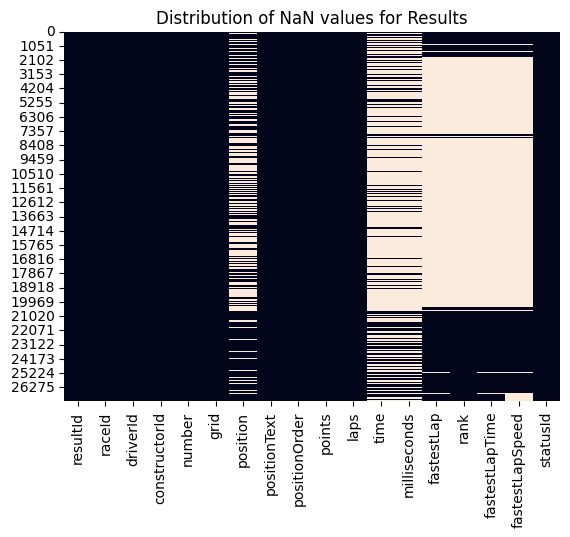
The position column has quite a few NaNs too, but this isn't as catastrophic as it looks, those missing values almost always correspond to DNFs, which we can infer from the linked statusId. The status lookup table itself is clean (140 statuses, nothing missing), so we have a complete taxonomy of why drivers didn't finish.
The drivers table has 802 out of 865 number fields missing and 757 out of 865 code fields missing, but these are historical artefacts of drivers who raced before permanent numbers were introduced. We won't be using them, so no issue there.
Feature Analysis
What we'll do now, is have a poke around in the data. Do patterns exist? What stories can we tell and what questions can we ask?
Constructor Dominance
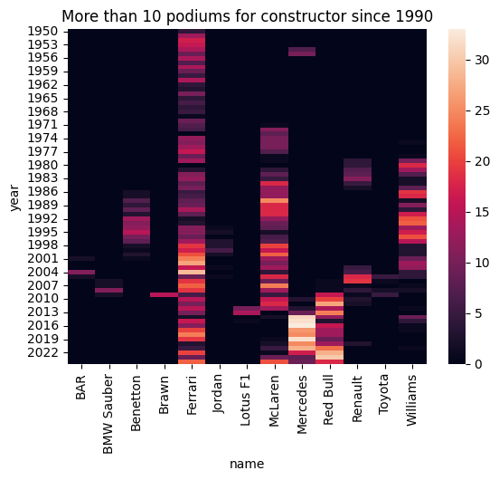
Anyone who's watched even a few races knows that F1 has eras, periods where one team is so comprehensively ahead of the field that the podium feels practically pre-ordained. Think Brawn in 2009, Red Bull between 2010 and 2013, or Mercedes' seemingly endless run of dominance through the hybrid era.
To verify this intuition in the data, we look at the number of podium finishes per constructor per year. The heatmap is striking, the pattern of dominance is unmistakable. Alfa Romeo dominates the early 1950s, Ferrari and Williams bookend different eras, McLaren and Williams trade blows through the 80s and 90s, and Red Bull and Mercedes carved up the last decade and a half almost entirely between them. The practical implication here is that constructor identity should carry real predictive signal, particularly if we can represent it in a way that captures recency of form rather than just all-time historical record.
Grid vs Finish Position Over Time
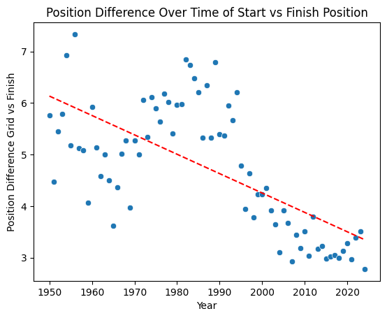
The next hypothesis to check is a simple one: does where you start predict where you finish? We compute the average absolute difference between grid position and finishing position, year by year, and plot it with a trend line.
position_difference_by_year_df["absPositionDifference"] = abs(
    position_difference_by_year_df["grid"] - position_difference_by_year_df["position"]
)
There's a clear downward trend, the gap between start and finish position has shrunk over time. The modern era is noticeably more "locked in" than the 1980s and 90s. There's an important caveat here though: we're not accounting for DNFs. A driver who crashes out on lap 1 and is replaced in the running order effectively inflates the position differences for everyone else. So this trend could be as much about cars getting more reliable as it is about overtaking becoming harder, or both. Either way, it flags grid position as a strong candidate feature, and also hints that DNF modelling might matter.
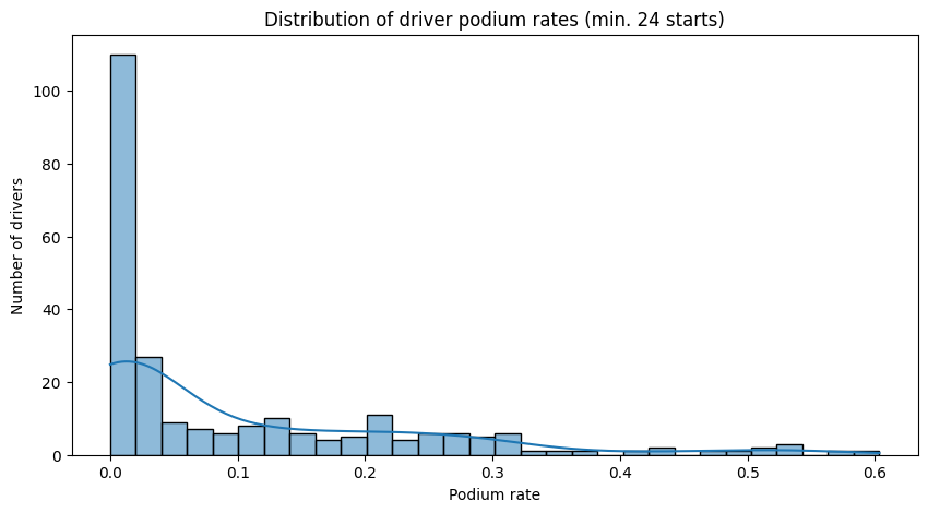
Driver Podium Rates
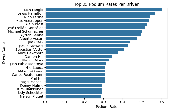
There's clearly something that separates the Hamiltons and Verstappens of the world from the rest of the field beyond just the car they're in. To quantify this, we compute each driver's podium rate - podiums divided by total race starts.
We have to be a little careful here though. Sorting by raw podium rate throws up noise at the top end: two drivers with a 100% podium rate who each raced exactly once, and a handful of others inflated by tiny sample sizes. To get something more meaningful, we filter to drivers with at least 24 career starts, roughly one full season's worth of races.
min_24_races_driver_position_df = driver_position_df[driver_position_df["race_count"] > 24]The resulting leaderboard is a who's who of the sport's legends. Juan Fangio sits at the top with a 60.3% podium rate over 58 races, genuinely absurd numbers. Lewis Hamilton is just behind at 56.7% across an astonishing 356 starts, with Max Verstappen not far behind at 53.6% across 209. There's clearly a meaningful spread in podium rates between drivers, which tells us that driver identity or some proxy for driver skill should be a useful feature rather than something we ignore.
We can also see this reflected in a wider distribution of drivers. There is a clear right skew to the data, there are a few people who are clearly better than the rest of the field and it's a measurable difference.
DNF Rates Over Time
The final thing we want to look at is reliability - specifically, how DNF rates have changed over the sport's history, and whether they vary meaningfully by constructor.
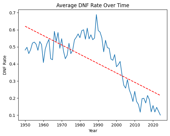
The trend across the full history of the sport is dramatic. In the early 1950s, nearly half of all race entries ended in a DNF. By 2020 that had fallen to around 15%. Modern F1 cars are extraordinarily reliable compared to what they were even in the 1980s and 90s, where mid-30% DNF rates were common.
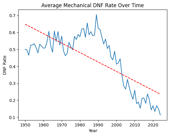
Crucially, this trend holds even when we strip out collision-related retirements and look at mechanical DNFs only, so it's not a case of the sport just getting safer for drivers while cars remain fragile. The reliability improvements are genuine.
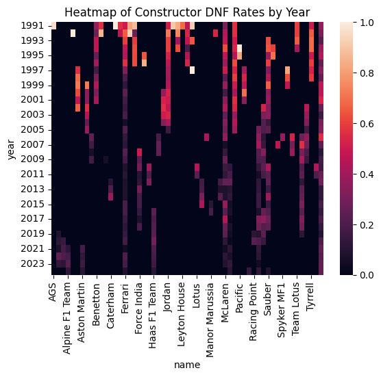
When we break this down by constructor and year in a heatmap, the picture gets more interesting. It's not that some constructors are uniformly bad at reliability, it's that specific constructors go through bad periods, often corresponding to technical regulations changes or a particular power unit generation. That time-varying, constructor-specific reliability signal feels like something worth engineering into our feature set.
What We've Learned
To summarise before we move on: the data is broadly clean but has some gaps we'll need to work around (particularly around fastest lap data). More usefully, we've identified a handful of features that look like they should carry real predictive signal: qualifying grid position, constructor identity (especially recent form), driver historical podium rate, and some kind of reliability/DNF risk signal at the constructor level. These will form the basis of our feature engineering in the next stage. First though, let's get a baseline on the table.
A More Realistic Baseline
Before we train a single model, we need something to beat. We said at the start that we'd define our success criteria upfront, and that the baseline would be: if you qualify in the top 3, you finish in the top 3. But we can do something slightly more principled than a hard binary rule - we can turn it into a probability by asking, for each grid position, what fraction of the time has a driver from that position historically finished on the podium?
This is still a heuristic. There's no model here, no features, no fitting. It's just a lookup table from grid position to podium rate. But it's a surprisingly informed one.
Building the Lookup Table
We join the qualifying and results data together to get a combined grid/finish dataframe, then label each result as a podium finish or not.
grid_result_df["podium"] = grid_result_df["position"] <= 3
podium_rate_by_grid = grid_result_df.groupby("grid")["podium"].mean().reset_index()
One thing to be aware of is that if we do this naively on the full historical dataset, we end up with grid positions going up to 34. That's because early F1 fields were much larger, 26-car grids weren't unusual in the 80s, and the pre-aerodynamic era featured even bigger fields. Trying to assign probabilities to grid positions that simply don't exist in the modern era is going to create noise, so we restrict the training window to 1990-2024, which gives us a consistent modern grid structure.
recent_grid_result_df = grid_result_df[
    (grid_result_df["year"] >= 1990) & (grid_result_df["year"] < 2024)
]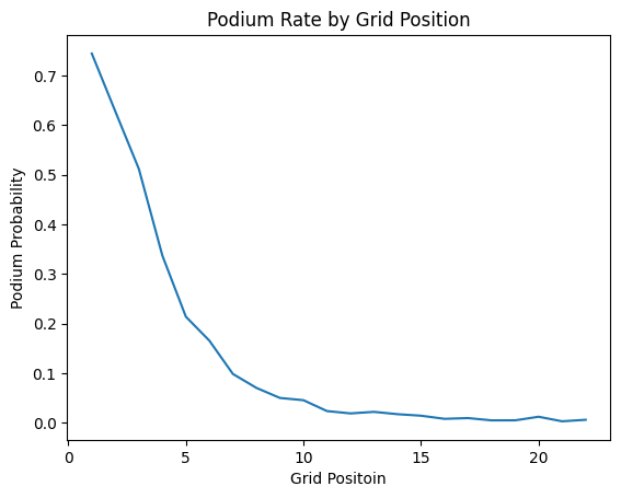
The resulting probabilities are pretty intuitive. P1 carries a 74.4% historical podium rate, P2 a 62.3%, P3 drops to 51.2%, and then there's a fairly sharp cliff - P4 is 33.2%, P5 is 21.1%, and by P10 you're down at 4.6%. After around P15 the signal is essentially noise. This is the lookup table that becomes our "model".
Evaluating on 2025
We apply this lookup to the 2025 season results - our held-out test set - by joining each driver's grid position to their historical podium probability. Then we evaluate against the actual 2025 podium outcomes.
fpr, tpr, thresholds = roc_curve(race_result_2025_df["podiumFinish"], race_result_2025_df["podiumProbability"])
auc_score = roc_auc_score(race_result_2025_df["podiumFinish"], race_result_2025_df["podiumProbability"])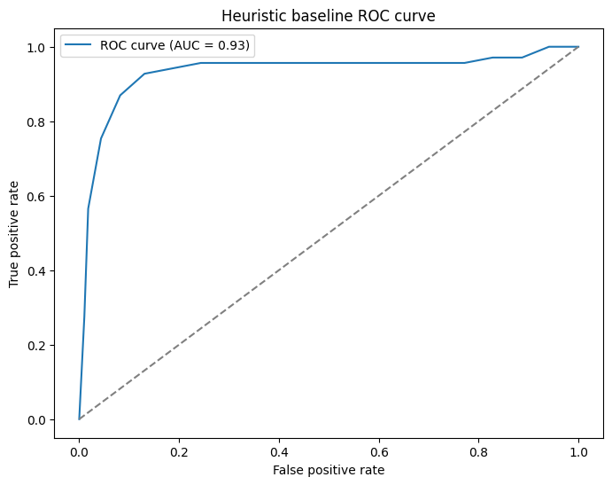
The ROC-AUC comes out at 0.93. For a lookup table. That's... awkward. In a good way.
The Brier score, which measures the accuracy of the probability estimates themselves rather than just their ranking, comes out at 0.0596. Closer to 0 is better (0 would be perfect), and 0.06 is genuinely pretty good for a model with no parameters.
Almost too good...
We've actually sort of made a mistake here...
There's actually a pretty big problem with the qualifying-based heuristic - it leaks a huge amount of unintended signal into the model. Qualifying position already has tyre performance, car setup, track conditions, and driver form baked right into it, so we're essentially marking our own homework. It's no wonder the metrics look so good.
On top of that, it's not a particularly useful model in practice. If we can only make predictions after qualifying has happened, we're already halfway through the race weekend. At that point, how useful is a podium prediction really?
The Rolling Podium Rate Heuristic
So, what do we use instead? A driver who has been consistently finishing on the podium over their last few races is probably more likely to do so again than one who hasn't. This solves our "same-weekend data" problem with just prior race history.
Specifically, we compute a rolling 5-race podium rate for each driver. For every race, we look at the five races immediately prior and ask, "what fraction of those did this driver podium in?". That becomes the predicted probability we carry forward.
Building It Without Leaking
The tricky bit here is making sure we don't accidentally include the current race in the rolling window. A shift(1) before the rolling mean takes care of that as it pushes each driver's history back by one position so the window always ends at the race before the one we're predicting.
race_results_by_year_df["podium"] = race_results_by_year_df["position"] <= 3

race_results_by_year_df["driver_podium_rate_5"] = (
    race_results_by_year_df.groupby("driverId")["podium"]
    .transform(lambda x: x.shift(1).rolling(5, min_periods=1).mean())
)
We train this on 1990-2024 and take each driver's final rolling rate as their going-in probability for 2025. For rookies or drivers with no prior history in the dataset, we assign a rate of 0. Because we don't have high expectations for them, and frankly the model shouldn't either.
Matching these probabilities onto the 2025 results is a simple left join on driverId. Any driver who doesn't appear in our historical data gets filled with 0.
How Does It Do?
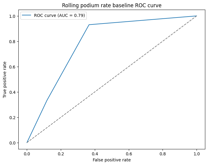
Honestly, worse. But that's sort of the point. The ROC-AUC drops to 0.79 and the Brier score rises to 0.12, both significantly behind the qualifying heuristic's 0.93 and 0.06 respectively.
It's also quite a bit more angular. This is a result of the rolling rate only being able to produce six distinct probability values (0, 0.2, 0.4, 0.6, 0.8, 1.0) because we're only looking at the past five races. So the ROC curve is really just six points joined by straight lines rather than a true curve. It's not a problem, the AUC is still a valid number, it just looks a little rougher.
But this is a better baseline to work against. The qualifying heuristic was always going to be hard to beat because it had so much same-weekend information baked in. A model that genuinely had to work with pre-weekend data only was always going to sit lower, and now we can see roughly where that ceiling is. 0.79 AUC is still pretty solid for something this simple. There is a signal here that we can tap into for sure, but there's clearly a lot more room for a proper model to improve on it, which is exactly what we want from a baseline.
Next Steps
We've got our baseline to measure against. Next time we can actually do some fun stuff with ML modelling to see if we can beat this.